Create a Fluid Layout From Scratch
By B Lingafelter CSS, HTML5
The purpose of this tutorial is to demonstrate how to build a two column fluid layout from the ground up. In the process, you will create a wireframe template that can be used like a snippet to quickly start future projects.
To get started, create a new HTML5 page in your editor and save it as 2col-fluid.html in a templates folder. (Note: IN112 students should save the templates folder in HTML Projects.) Be sure to add the doctype tag, basic document structure (html, head, and body elements), and the <meta> and <title> elements in the <head>, as shown below. Go ahead and add the <style> element now too for the embedded stylesheet. Yes, you should generally create external stylesheets for web projects, but sandboxing the style rules in the template makes it handy to use down the road for other projects.
<!DOCTYPE html>
<html>
<head>
  <meta charset="UTF-8">
  <title>Two Column Fluid Layout Template</title>
  <style>

  </style>
</head>
<body>

</body>
</html>
Got your page created? Good. Now let's build a wireframe of the design mockup shown below. It has five major divisions; header, nav, main, sidebar, and footer. Note that both the main and the sidebar divs float left.
Insert the Divs
In general, you should insert the div elements starting from the top of the page and work your way down to the bottom. Note that when the desired layout requires one or more floated elements, the order of the divs in the code is important.
When a floated element is removed from the normal flow to float left or right, the non-floated elements that follow it in the source code will move up and wrap around the floated element if there's enough space. So if only one div in your design will be floated, like a sidebar or navbar, place the sidebar (navbar) div before the remaining content in the code.
If two (or more) elements in the layout will float next to each other, the order of these divs in the code won't necessarily affect visual appearance but will impact accessibility, as screen readers and some assistive devices ignore CSS. In this example, place the #main div before #sidebar so that screen readers and other assistive devices will read the most important content first.
Insert a <div> element and some placeholder text for each logical division you will need on the page. Here are the five divs needed for this wireframe example.
<body>
  <div id="header">Content for  id "header" Goes Here</div>
  <div id="nav">Content for  id "nav" Goes Here</div>
  <div id="main">Content for  id "main" Goes Here</div>
  <div id="sidebar">Content for  id "sidebar" Goes Here</div>
  <div id="footer">Content for  id "footer" Goes Here</div>
</body>
Set the Default Properties
Create a style rule for the body selector to set the base (default) properties you want all the child elements to inherit. To compensate for browser differences in the handling of margins and padding, you should also reset both to 0 (zero). At minimum, you should include all of the following properties.
<style>
body {
  font-family: sans-serif; /* font stack inherited by all child elements */
  font-size: 100%; /* sets default size inherited by all child elements */
  line-height: 1.5; /* unit-less value scales in child elements based on font size */
  background-color: #F9932E; /* specifies color for entire page */
  margin: 0; /*  compensates for browser differences */
  padding: 0; /* compensates for browser differences */
  }
</style>
Save your page and preview it in a browser. At this point, the divs are not visible in the browser because <div> is just a generic block element without any visible formatting. To make the divs visible, you need to set a background color for each div, or use the outline property to apply visible borders. Just like Russ Weakley's Colored Boxes approach, you must set the width for any floated divs in your design, and may also want to set temporary height properties to simulate the final layout after adding the actual text content, background graphics, etc.
Calculating Widths in Fluid Layouts
In a fluid layout, we still use em-based typography (font-size, line-height, etc.) for all child elements. But all width, margin, and padding values should be specified in percentages. Keep in mind that to avoid breaking the layout, the total width of all floated elements cannot exceed 100% of the parent container. Applying the rule of thirds for a two column layout, setting the width of the wide #main div to 66.66% and the narrow #sidebar to 33.33% keeps the total just shy of 100% and allows for browser rounding to pixels without breaking the layout. That all sounds easy enough until you remember that padding and margin will likely be needed in most designs to add negative space to the layout. Great, now what?
A really smart guy named Ethan Marcotte, who wrote a game changing article on Responsive Web Design at A List Apart in 2010, also wrote a chapter on fluid grids in Dan Cederholm's book, Handcrafted CSS. In case you're wondering where this is going, just remember that fluid layouts are one of the main components of responsive web design which is where we are headed. Ethan wrote the following in that chapter.
“Every aspect of a grid, and the elements placed within it, can be expressed as a proportion relative to its container. As when we size type for the Web, we shouldn't look at the desired size of an element but the relationship of that size to the element's container. So rather than setting our columns in rigid, inflexible pixels, we can convert those pixel-based widths into percentage-based values, which will keep the proportions of the grid intact as it resizes.”
Ethan also laid out a formula we can use to to convert pixel widths into percentages: target ÷ context = result
Let's digress for a moment back to the days of fixed-width layouts when this wireframe example was created. Originally, the page width was fixed to 960 pixels. Using the rule of thirds, I set the width of #main to 640 pixels and #sidebar to 320 pixels. When it became obvious negative space (breathing room) for the text was needed, 20 pixels of left and right padding was added to each div. If you're doing the math here, that totals more than 960 pixels and would have broken the layout. Finally, after subtracting 40 pixels from the width of each div, the #main and #sidebar widths were successfully set to 600 pixels and 280 pixels respectively. That layout didn't break in the browser and was used as a starting point for many web projects.
Fast forward, now to use Ethan Marcotte's famous target ÷ context = result formula to calculate the percentages we need for this fluid layout template. For the #main div, we divide the target width of 600px by the context of 960px (width of the parent) which gives us .625 or 62.5%. For the #sidebar, we divide the target width of 280px by 960px which gives us .2916666 or 29.16666%. And finally, for the padding, we divide the target 20px by 960px which results in .0208333 or 2.08333%.
The take-away is that even when you are not converting a fixed layout to fluid, you can still use the formula. Just assign an arbitrary but plausible pixel width to the parent container (like 960 or even 1024) and use that value to calculate the widths of the floated elements. Then apply the target ÷ context = result formula to calculate the percentages and start building.
Create ID Style Rules
So the next step is to create the rules for each uniquely identified <div> element in your design. The code sample below shows the essential properties for each of the five divs in the wireframe example.
Notes for this example:
- A temporary height is added to #header to make it taller and give it a more realistic appearance. If the amount of content added later in an actual project is sufficient, you may need to delete the height. Except in cases where background images are used, you should generally allow the content to control height.
- Both #main and #sidebar will float left so they will need float and width properties. Floated elements must have a set width or they will take 100% of the available space.
- Using Ethan Marcotte's famous formula, illustrated above, set the width of #main to 62.5% and #sidebar to 29.16666%.
- Padding and margin values are calculated the same way. Set the left and right padding to 2.08333% for the #main, #sidebar, and #footer divs.
- The clear property is added to #footer to remove the float; no other elements are allowed on either the left or right side of the footer.
Remember, your goal at this point is just to create a wireframe of colored or outlined boxes; don't get too carried away with other formatting just yet.
#header {
  height: 8em; /* creates visible box in browser */
  background-color: #FBD260; /* sets color of the div */
  }
#nav {
  text-transform: uppercase;
  font-weight: bold;
  background-color: #B40605; /* sets color of the div */
  text-align: right;
  }
#main {
  float: left;
  width: 62.5%; /* required to float; 600 / 960 = .625 */
  background-color: #FFFFFF; /* sets color of the div */
  padding: 0 2.08333%; /* 20 / 960 = .0208333 */
  }
#sidebar {
  float: left;
  width: 29.16666%; /* required to float; 280 / 960 = .2916666 */
  background-color: #FBD260; /* sets color of the div */
  padding: 0 2.08333%; /* 20 / 960 = .0208333 */
  }
#footer {
  font-size: 1em;
  font-weight: bold;
  color: #FFBF41;
  background-color: #B40605; /* sets color of the div */
  clear: both; /* removes float; no elements allowed on either side */
  padding: 0 2.08333%; /* 20 / 960 = .0208333 */
  }
Save your page and preview it in a browser. Make adjustments as needed until all the <div>s are positioned correctly. Do not proceed until you are happy with the placement of your divs.
Create the Wrapper
To center the layout in the viewport and/or to set limits on the overall width of the page content, you may want to add a wrapper. To insert a div that can act as a wrapper, the opening <div> tag must be immediately after the opening <body> tag and the closing </div> tag must be immediately before the closing </body> tag. All of the page content must be nested inside the wrapper div.
<body>
  <div id="wrapper"> <!-- Start #wrapper div -->
    <div id="header">Content for  id "header" Goes Here</div>
    <div id="nav">Content for  id "nav" Goes Here</div>
    <div id="main">Content for  id "main" Goes Here.</div>
    <div id="sidebar">Content for  id "sidebar" Goes Here.</div>
    <div id="footer">Content for  id "footer" Goes Here</div>
  </div> <!-- End #wrapper div -->
</body>
All that remains now, is to style the #wrapper. In this example, set a width of 90% and set left/right margins to auto which divides any left over space in the viewport equally between the left and right, keeping the page centered in most browsers. Setting a maximum width keeps line lengths from growing too long when browser viewports are wide.
#wrapper {
  background-color: #FBD260;
  width: 90%; /* percentage of viewport */
  margin: 0 auto;
  max-width: 64em;
  }
Save and preview the page in a browser. Just for kicks and grins, feel free to change the float direction to right for both the #main and #sidebar. Tada!
One more thing inquiring minds commonly want to know. The #sidebar doesn't actually extend all the way to the #footer. It just looks like it does because the #wrapper has the same background color as the #sidebar. You're actually seeing the #wrapper background below the #sidebar. Want proof? Change the #wrapper background color.
The Next Step
To finish up your template, add some dummy text to the #main and #sidebar divs. Not too much though, a paragraph or two is plenty. Remember this is just a template, so don't go overboard. If you decide to use a copy of this to start a real web project, you'll have to replace the dummy text with actual content anyway.
Places to grab dummy text:
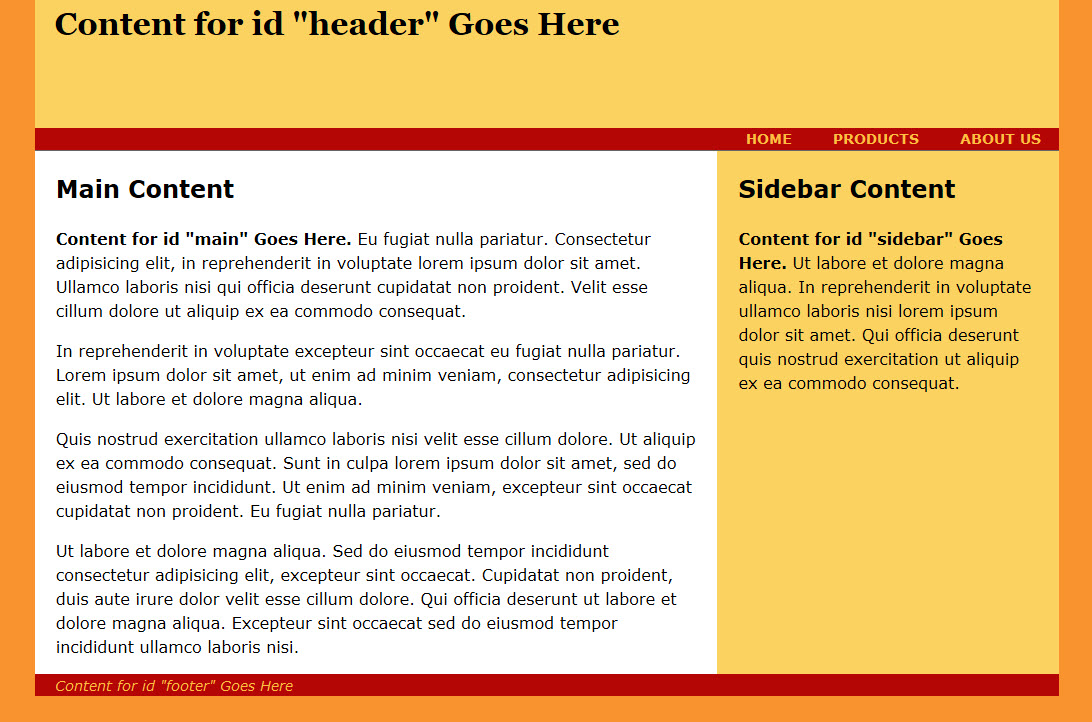
Every web project is different, so don't waste your time styling the typical elements (headings, paragraphs, lists, etc.) and adding graphics to the template. Save that for a real web project. And just in case you're interested, here's a screenshot of one completed example based on the original layout for this template. Yes, it's old and ought to be replaced. I'll do that, someday.